How to Use the Psychology of Color in Business Branding
The psychology of color in business branding is the strategic study of how specific hues influence human emotions, perceptions, and decision-making. By applying these principles, businesses can evoke desired feelings—such as trust, urgency, or luxury—directly impacting consumer behavior, brand recognition, and long-term customer loyalty in competitive markets.
What is the psychology of color in business branding?
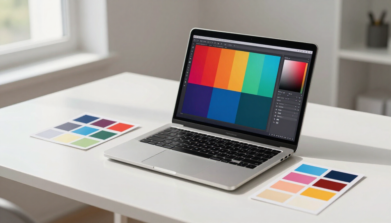
The psychology of color in business branding is more than just selecting a visually appealing palette; it is a sophisticated marketing tool that taps into the subconscious mind of the consumer. Every color sends a specific message and triggers a distinct psychological response. For instance, when a consumer sees a blue logo, their brain often associates it with stability and reliability. Conversely, a red logo might stimulate appetite or create a sense of immediate excitement.
In professional brand development, color is used to communicate a company's values without saying a word. This non-verbal communication is essential because the human brain processes visuals much faster than text. Understanding these associations allows businesses to position themselves effectively within their niche. Whether you are launching a new startup or undergoing a comprehensive rebranding through Website Design , the colors you choose will dictate how the world perceives your professional identity.
Why is color choice critical for brand identity?
First impressions are often permanent. Research suggests that consumers make a judgment about a product or brand within 90 seconds of their initial interaction, and up to 90% of that assessment is based on color alone. This makes the psychology of color in business branding a foundational element of any successful Search Engine Optimization and marketing strategy. If your visual identity clashes with your brand message, you risk alienating your target audience before they even read your content.
Consider the following reasons why color is vital:
- Recognition: Color increases brand recognition by up to 80%.
- Differentiation: It helps you stand out in a crowded marketplace.
- Emotional Connection: Hues can foster an immediate bond with the user.
- Consistency: A unified palette builds professional credibility across platforms.
- Navigation: In web design, color guides users toward specific actions.
The Emotional Impact of Primary and Secondary Colors
To master the psychology of color in business branding, one must understand the specific traits associated with the most common colors used in modern marketing. Each hue carries a weight that can either support or undermine your business goals.
Red: The Color of Energy and Urgency Red is a powerful color that increases heart rate and creates a sense of urgency. It is frequently used in clearance sales and by food industries to stimulate appetite. In a business context, red signifies passion, power, and action. However, it should be used sparingly, as overusing red can lead to feelings of aggression or danger.
Blue: The Color of Trust and Security Blue is arguably the most popular color for corporate branding, especially in the financial, legal, and technology sectors. It evokes feelings of calmness, stability, and professionalism. Because it is associated with the sky and the ocean, it feels permanent and reliable. Brands that want to be seen as dependable often lean heavily into various shades of blue.
Green: The Color of Growth and Health Green is synonymous with nature, health, and tranquility. It is the easiest color for the human eye to process. In business, it is used by brands that want to emphasize environmental friendliness, organic products, or financial growth. It creates a sense of peace and renewal, making it ideal for wellness and eco-conscious industries.
Yellow: The Color of Optimism and Clarity Yellow is the brightest color to the human eye and is often associated with happiness and sunshine. It is used to grab attention and project a friendly, accessible vibe. While it can be very effective for highlighting calls to action, too much yellow can be overwhelming and lead to eye strain, so balance is key.
Black and White: The Colors of Sophistication Black represents luxury, elegance, and authority. It is the go-to choice for high-end fashion and automotive brands. White, on the other hand, represents purity, simplicity, and cleanliness. Together, they create a high-contrast, timeless look that suggests a brand is modern and refined.
How do you choose the right color palette for your business?
Selecting a color palette involves more than just picking your favorite shades. It requires a deep dive into your brand’s thousands of low-quality links from obscure directories, link farms, or unrelated websites. Google's algorithm has grown sophisticated enough to distinguish between the two — and to penalize sites that try to game the system with artificial or manipulative link schemes.
Selecting a color palette involves more than just picking your favorite shades. It requires a deep dive into your brand's core identity, your target audience's psychology, and the competitive landscape of your specific industry. The goal is to choose colors that feel authentic to your values, resonate emotionally with the customers you want to attract, and distinguish you clearly from the competitors they're comparing you against.
Define Your Brand Personality First
Before you open a color wheel or browse a palette generator, articulate who your brand is in human terms. If your business were a person, how would you describe them? Are they authoritative and dependable, like a financial advisor? Creative and energetic, like a boutique design studio? Calm and nurturing, like a wellness practitioner? The personality traits you identify should map directly to the emotional associations of the colors you choose. A cybersecurity firm projecting trustworthiness has very different color needs than a children's party supply company projecting joy and excitement.
Study Your Target Audience
Color perception is not universal. It is shaped by age, gender, cultural background, and personal experience. Research consistently shows that color preferences vary significantly between demographic groups. Women, on average, tend to respond more positively to softer tones and broader color palettes, while men often gravitate toward bolder, more saturated hues. Younger audiences are more receptive to unconventional color combinations that signal creativity and disruption, while older demographics frequently associate professionalism with more conservative, established palettes.
Cultural context matters equally. White symbolizes purity and new beginnings in Western markets but is associated with mourning in several Asian cultures. Red signals good fortune and celebration in China but danger or urgency in North America. If your business operates across cultural boundaries — or if your Southern Maryland customer base is more diverse than it might appear — these distinctions deserve careful consideration before you finalize any branding decision.
Analyze Your Competitors — Then Differentiate Strategically
Mapping the color landscape of your industry is an essential step that many businesses skip. Look at the dominant colors used by your top five competitors. You will almost always find patterns — financial services cluster around blue, health and wellness gravitates toward green, food service leans into red and yellow. Understanding the prevailing palette of your industry gives you two options: align with it to signal category membership, or deliberately break from it to claim immediate visual distinction.
Neither choice is inherently right. If trust and familiarity are paramount — as in legal services or healthcare — aligning with established industry conventions can be the smarter play. If differentiation and disruption are central to your value proposition, choosing a color that stands apart from every competitor in your category can make you instantly memorable. The key is making the choice deliberately, based on strategy, rather than defaulting to convention or personal taste.
Build a Functional Palette, Not Just a Primary Color
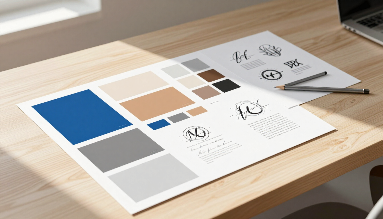
Most businesses make the mistake of selecting a single primary color and calling it a brand palette. A functional brand color system typically includes a primary color that carries the brand's core identity, one or two secondary colors that complement and expand the primary's emotional range, a neutral color for backgrounds and body text — most commonly white, off-white, or light gray — and an accent color used sparingly for calls to action, highlights, and moments where you want to direct a viewer's attention.
The relationship between these colors must be tested in practice, not just evaluated on a mood board. How does your palette perform on a white background? On a dark background? In a single-color print scenario like an embroidered logo or a engraved business card? Does it remain legible and distinguishable for users with color vision deficiencies, which affect approximately 8% of men and 0.5% of women? A palette that works beautifully in a digital mockup but fails in real-world applications is not a finished palette.
How Does Color Psychology Apply to Website Design?
Your website is the single most visible application of your brand's color system, and the stakes are high. Color decisions on a website go far beyond aesthetics — they directly influence user behavior, navigation patterns, and conversion rates. Every color choice on a page is a subconscious instruction to the visitor about where to look, what to feel, and what to do next.
Color and Calls to Action
The color of a call-to-action button is one of the most studied and debated elements in conversion rate optimization. The research does not point to a single universally superior color — rather, it consistently points to the importance of contrast. A call-to-action button that stands out clearly from its surrounding background and page elements draws the eye and earns more clicks, regardless of its specific hue. If your primary brand color is blue, a green or orange call-to-action will typically outperform a blue one because it creates visual tension and stands apart from the established color field of the page.
Color and User Trust
First-time visitors to your website make an almost instantaneous judgment about whether your business looks legitimate and professional. Color is a primary driver of that judgment. A color palette that feels cohesive, intentional, and appropriate for your industry signals that your business is organized and credible. A palette that feels arbitrary, dated, or inconsistent signals the opposite. For businesses like contractors, professional services firms, and healthcare providers — where trust is the primary conversion barrier — the wrong color palette can cost you clients before they read a single line of your copy.
Color and Accessibility
An often-overlooked dimension of web color design is accessibility. The Web Content Accessibility Guidelines (WCAG) set minimum contrast ratio standards between text and background colors to ensure readability for users with visual impairments. Failing to meet these standards is not just an ethical oversight — it is a legal risk in some jurisdictions and a direct contributor to higher bounce rates, as users who cannot easily read your content will leave. Every color palette chosen for a website should be evaluated against WCAG contrast standards before implementation.
Color Consistency Across the Digital Experience
Color behaves differently across devices and display types. A brand color that looks rich and saturated on a high-resolution MacBook display may appear washed out on an older Android phone or oversaturated on a budget monitor. Professional web designers account for these variations using standardized color systems — typically specifying colors in both HEX values for digital use and Pantone or CMYK values for print — to ensure as much consistency as possible across every surface where the brand appears.
How Does Color Psychology Differ Across Industries?
While the emotional associations of individual colors are relatively consistent, their strategic application varies significantly by industry. Understanding the conventions and expectations of your specific market is essential for making color choices that feel both appropriate and distinctive.
Healthcare and Wellness: Blue and green dominate this sector for good reason — they evoke calm, cleanliness, and healing. White plays a significant supporting role, reinforcing sterility and precision. Brands in this space that introduce warmer tones like soft coral or warm gold are making a deliberate choice to feel more approachable and human, differentiating themselves from the clinical coldness of purely blue-and-white healthcare branding.
Financial Services and Legal: Navy blue, forest green, and charcoal gray are the near-universal language of finance and law. These colors communicate stability, authority, and security — the precise emotional notes that clients need to feel before entrusting anyone with their money or their legal matters. Disruption in this space comes from fintech and modern legal startups that deliberately break the convention with bold purples or energetic oranges to signal that they are a different kind of financial or legal experience.
Food and Beverage: Red and yellow are the two most dominant colors in food marketing for a neurological reason — they genuinely stimulate appetite and create a sense of urgency and excitement. Orange occupies a similar space, combining the energy of red with the approachability of yellow. Green has grown substantially in this sector as consumer demand for organic, natural, and health-conscious options has increased. Premium food and beverage brands frequently pivot to black, deep navy, or matte earth tones to signal luxury and artisanal quality.
Technology and Software: Blue retains its dominance in tech as a signal of reliability and innovation, but the sector has seen significant experimentation with gradients, purples, and vibrant accent colors as brands compete to project creativity and forward momentum. Black-dominant palettes are used by premium tech brands to signal sophistication. Startups frequently use bold, unexpected color combinations to communicate disruption and energy.
Retail and E-Commerce: Color strategy in retail is highly audience-dependent. Luxury brands gravitate toward black, white, and gold. Fast fashion and youth-oriented brands embrace bold, high-saturation palettes that shift with seasonal trends. Sustainable and ethical retail brands lean heavily into earth tones, muted greens, and natural textures to signal their values before a customer reads a single product description.
Construction, Trades, and Professional Services: Orange, red, and dark blue are common in this sector, projecting reliability, hard work, and physical capability. For Southern Maryland contractors and service businesses, a strong, confident color palette paired with professional photography and a well-designed website creates an immediate perception of competence that can be the deciding factor for a homeowner choosing between multiple bids.
What Is Color Consistency and Why Does It Matter for Branding?
Color consistency is the disciplined application of your brand's defined color palette across every single touchpoint where your business is represented — your website, social media profiles, printed materials, vehicle wraps, uniforms, signage, packaging, and email communications. It sounds straightforward, but for most small and medium businesses, it is one of the most commonly neglected aspects of professional branding.
The reason consistency matters so deeply is rooted in how recognition is built. Your brand color, when seen consistently over time, becomes a trigger. It trains your audience to associate that color — or that specific combination of colors — with your business before they even register your name or logo. Think of the specific shade of red associated with Coca-Cola, the precise brown of UPS's delivery trucks, or the unmistakable teal of Tiffany & Co.'s packaging. These are not accidents. They are the cumulative result of decades of disciplined color consistency.
For a small business, the timeline is shorter and the scale is smaller, but the principle is identical. A customer who sees your blue-and-white branded truck, visits your blue-and-white website, and receives a blue-and-white invoice is having a consistent brand experience that builds recognition and trust with every repetition. A customer who encounters three different shades of blue across those same touchpoints is subconsciously registering inconsistency — and inconsistency reads as carelessness.
Maintaining consistency requires establishing a documented brand style guide that specifies your exact color values in every relevant format: HEX for web, RGB for screen, CMYK for print, and Pantone for physical production. Every vendor, designer, and internal team member who produces materials on behalf of your brand should work from this document. Without it, color drift is inevitable — and color drift erodes the recognition equity you've worked to build.
When Should a Business Rebrand Its Color Palette?
Color palettes, like any element of a brand, have a lifespan. The visual language that felt modern and compelling when a business launched in the 1990s or early 2000s may feel dated today. Knowing when it is time to refresh your palette — and when to leave it alone — is a judgment call that requires both strategic clarity and honest self-assessment.
There are several clear signals that a color refresh may be warranted. If your branding consistently looks out of place next to your competitors' materials, it may be time to modernize. If your business has evolved — in terms of the services you offer, the clients you serve, or the market position you occupy — but your visual identity still reflects who you were rather than who you are, realignment is overdue. If customers or prospects have commented that your materials look dated, that feedback is worth taking seriously.
Equally important is knowing when not to change. If your color palette has strong recognition equity — if your audience immediately associates those specific colors with your business — changing it carries real risk. A rebrand that alienates an established customer base is a far more costly mistake than maintaining a palette that feels slightly conservative. Significant color changes should be approached gradually and communicated clearly to your existing audience.
adPRO has guided businesses throughout Southern Maryland through both brand launches and strategic rebrands for more than two decades. Whether the goal is building a visual identity from the ground up or evolving an existing one, our approach begins with strategy — understanding your market, your audience, and your goals — before a single color is chosen.
Frequently Asked Questions About Color Psychology in Business Branding
What color is best for a business logo?
There is no universally "best" color for a business logo. The right choice depends on your industry, target audience, brand personality, and competitive landscape. Blue is the most widely used color in corporate branding because of its associations with trust and stability. However, the most effective logo color is one that authentically represents your brand's values and meaningfully differentiates you from your competitors.
Does color really affect buying decisions?
Yes, significantly. Research indicates that up to 90% of a consumer's initial judgment about a product is based on color alone, and that color increases brand recognition by up to 80%. Color influences perceived value, triggers emotional responses, and guides attention — all of which directly affect whether and how quickly a consumer decides to buy.
What colors should I avoid in business branding?
No color is inherently off-limits, but some carry higher risk in certain contexts. Brown is rarely used as a primary brand color because it can feel dull or uninspiring without careful application. Neon colors can project energy but often read as unprofessional in industries where trust and authority are paramount. The most important principle is not which colors to avoid universally, but which colors are misaligned with your specific brand message and audience expectations.
How many colors should a brand use?
Most brand identity systems work best with three to five colors: a primary color, one or two complementary secondary colors, a neutral base, and a high-contrast accent used for calls to action. Using too many colors dilutes brand recognition and creates visual chaos. Using too few can feel restrictive and limit creative flexibility across applications.
Can the wrong brand colors hurt my business?
Yes. Color misalignment — where your palette contradicts your brand message or alienates your target audience — can reduce trust, lower perceived value, and increase bounce rates on your website. A financial services firm using neon green and orange, or a children's brand using heavy black and charcoal, creates cognitive dissonance that undermines credibility before any content is read.
How do I know if my current brand colors are working?
Ask your customers. Survey new clients about their first impressions of your website and materials. Monitor your website's bounce rate and time-on-page metrics — both are influenced by visual design. Compare your visual identity honestly against your top competitors. If your materials consistently feel dated, inconsistent, or misaligned with the experience you actually deliver, a brand audit with adPRO is a worthwhile starting point.
Build a Brand That Works as Hard as You Do
Color is one of your most powerful business tools — and one of the most frequently underestimated. The right palette, applied consistently across every touchpoint, builds recognition, establishes trust, and creates the emotional foundation that turns prospects into customers and customers into advocates.
At adPRO LLC, our branding and graphic design services are built on the same principle that has guided our work since 1999: strategy first, creativity second. We help businesses throughout Southern Maryland and across the United States develop color systems and visual identities that are grounded in an understanding of their market, their audience, and their long-term goals.
Whether you are building a brand from the ground up, refreshing an identity that has outgrown its original design, or simply trying to understand why your current branding isn't performing the way it should, we are ready to help.
Call adPRO LLC: 443-532-6467 Serving Calvert County, St. Mary's County, Charles County, and businesses across the United States since 1999.
It's Your Business, Let's Build it!
We will get back to you as soon as possible.
Please try again later.
Recent Posts