
Evaluate the ROI impact of hiring specialized revenue-focused web design experts. Learn how strategic design drives leads and measurable business growth.

Discover how local search ranking experts can transform your small business visibility. Learn about Google Maps, AEO, and local SEO strategies for 2026.

Learn how long a banner ad needs to run to generate clicks and sales. Discover factors influencing performance and timing for digital advertising success in 2026.
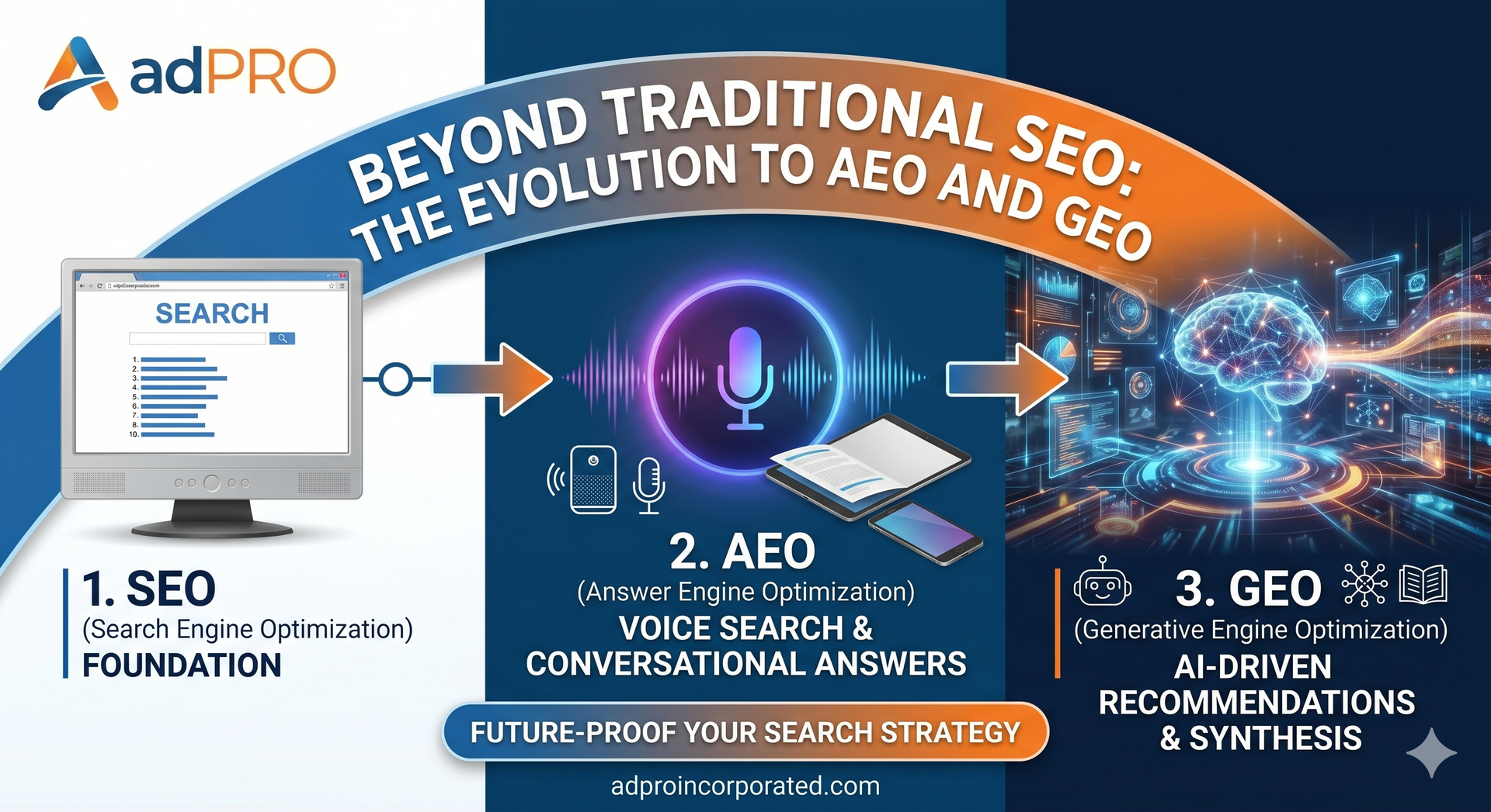
Why Your Business Needs All Three: SEO, AEO, & GEO

Can SEO help if you don't have a Google My Business profile? Learn how organic SEO drives traffic, & wins customers without a local map listing.

Discover why search engine optimization requires 4-12 months to deliver results. Learn about authority, competition, and technical factors in this 2026 guide.
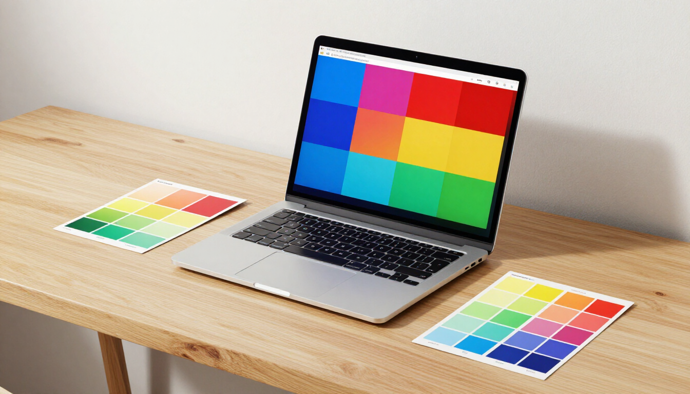
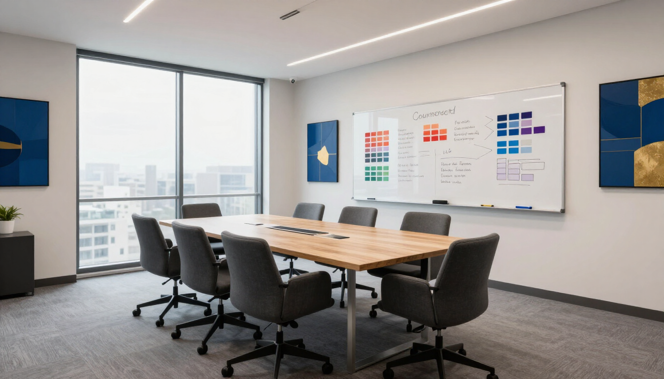
Unlock the 7Cs of web design to improve your site's UX, SEO, and conversion rates. Our guide covers Context, Content, Community, and more for 2026.

Discover what GEO in SEO is and how Generative Engine Optimization helps your business rank in AI-driven search results. Learn strategies for 2026.

Learn what Answer Engine Optimization (AEO) is and how to optimize your business website for AI search engines like ChatGPT and Google Gemini.

Compare DIY marketing vs. hiring an agency. Learn which path delivers better ROI for small businesses based on cost, expertise, and long-term scalability.